Exploring Demographic, Financial, and Geographic Insights Through Data
In this project, I created an interactive dashboard using randomly generated data to provide a comprehensive overview of a sample group of 35 individuals. The dashboard blends demographic, financial, professional, and geographic perspectives to paint a clear picture of the group’s profile.
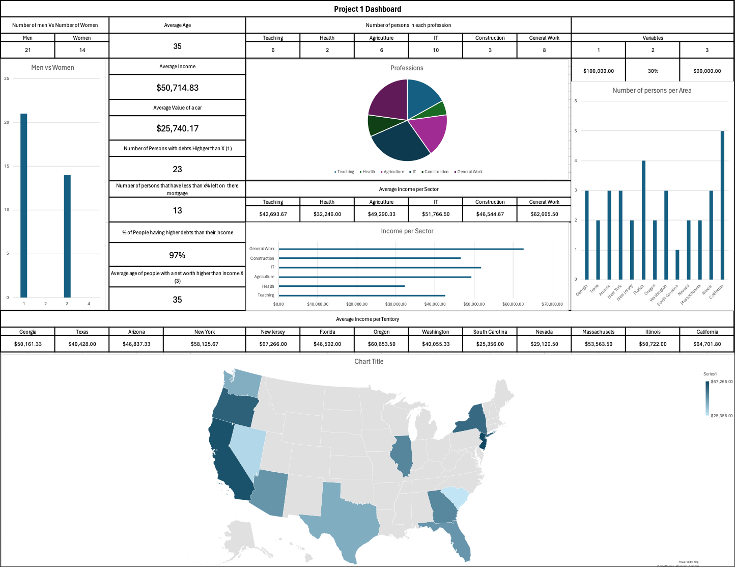
Demographics at a Glance
Our group consists of 21 men and 14 women, with an average age of 35 years. This balanced spread helps us analyze trends without a heavy skew toward one gender or age group.
Financial Overview
- Average Income: $50,714.83
- Average Car Value: $25,740.17
- High Debt Levels: 23 individuals have debts exceeding a set threshold.
- Mortgage Progress: 13 people have less than 20% left to pay on their mortgage.
- Debt-to-Income Concern: A significant 97% of the group has debts higher than their income.
- Net Worth Insight: The average age of people with a net worth exceeding a certain value is also 35 years.
Professional Landscape
The group spans diverse professions:
- Teaching: 6
- Health: 2
- Agriculture: 6
- IT: 10
- Construction: 3
- General Work: 8
When it comes to earnings, General Work leads with $62,665.50, followed by IT at $51,766.50. Health roles have the lowest average income at $32,246.
Geographic Distribution
Our participants come from 13 U.S. states, with incomes ranging from $25,356 in South Carolina to $67,266 in New Jersey.
The dashboard visualizes this through:
- A U.S. map showing average income by state.
- Bar charts comparing regional incomes.
Why This Dashboard Matters
This dashboard offers a quick yet thorough way to understand a small population’s demographics, finances, and professional spread. By combining charts, a pie graph, and a geographic map, it becomes easy to spot patterns and outliers.
It’s a useful tool for anyone looking to turn raw data into clear, actionable insights — whether for academic projects, business planning, or simply exploring how different factors correlate.
💡 Created entirely in Excel using random data, this project demonstrates how visual storytelling with data can reveal meaningful insights in seconds.