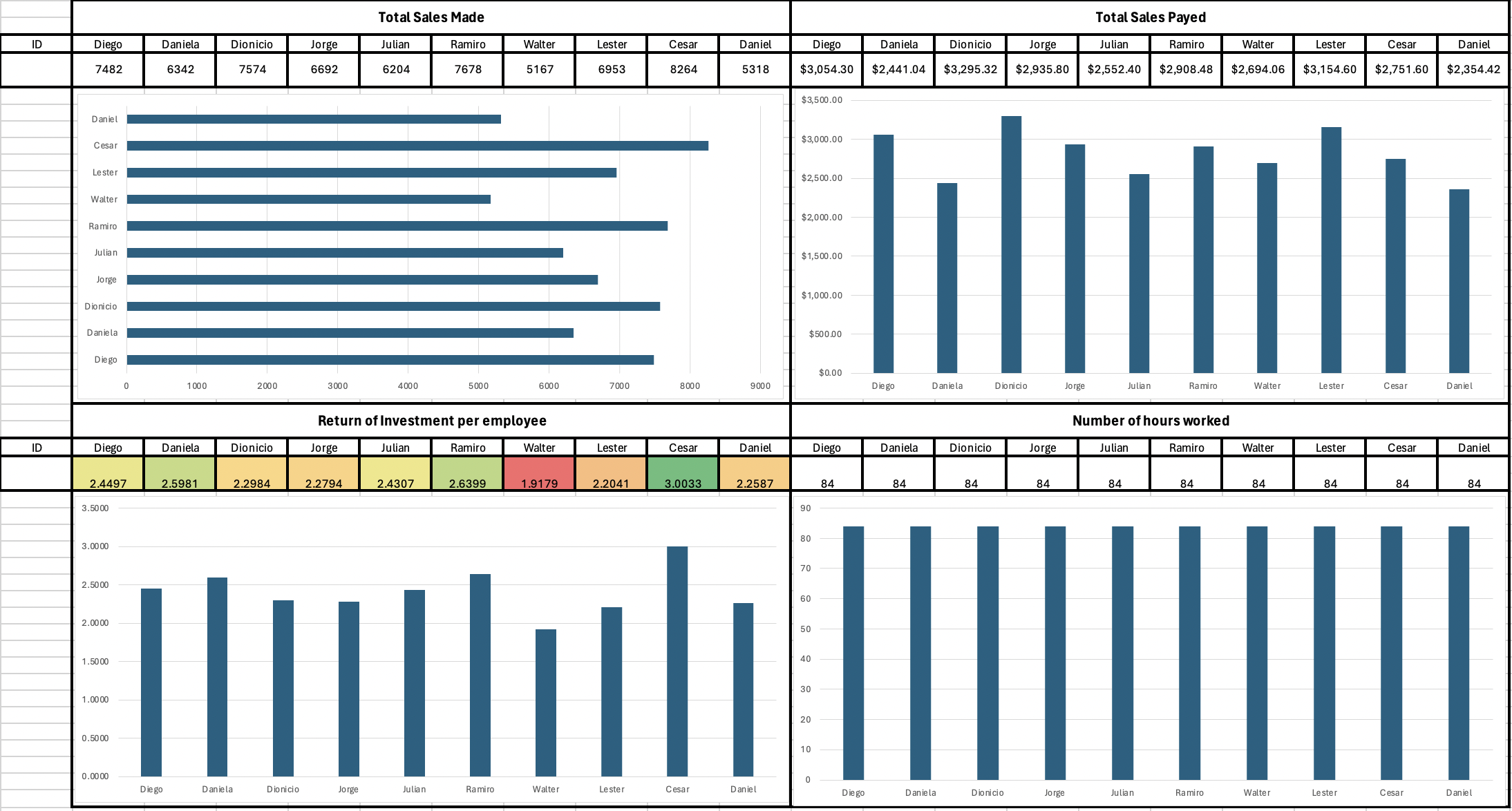
Employee Performance Dashboard
I designed this dashboard as part of an Excel-based app I built, using randomly generated data to simulate real business performance metrics. It tracks and compares 10 employees across key indicators: total sales, payments received, return on investment (ROI), and hours worked.
Key Performance Insights
The dashboard shows sales performance ranging from 5,167 (Walter) to 8,264 (Cesar), with Cesar leading in both sales and ROI (3.00), making him the most efficient performer. In contrast, Walter shows the lowest ROI (1.91), highlighting opportunities for improvement.
Payments and Revenue
Payments received range from $2,354 (Daniel) to $3,154 (Lester), showing differences between generated sales and collected revenue.
Work Hours
To maintain fairness, all employees logged 84 working hours, ensuring accurate comparisons.
Dashboard Visualizations
- Bar charts for total sales and total payments
- Color-coded ROI matrix for quick identification of top and low performers
- Hours worked comparison to ensure fair productivity analysis
Why This Dashboard Matters
This dashboard delivers a clear and interactive way to analyze performance. By integrating multiple KPIs in one view, it makes it easy to identify both strengths and areas for improvement.
Tools & Skills
- Tools Used: Excel (custom-built app with random data generation)
- Skills Demonstrated: Data visualization, dashboard design, performance tracking, Excel app development