CM and YTD Profit and Loss Dashboard
This dashboard has been created to showcase proficiency in Power BI. It is important to note that all data presented within this dashboard is entirely random and fictitious. None of the information reflects real-world data from any company or organization. The dataset was generated solely for the purpose of practice and to demonstrate data visualization and analytical skills using Power BI.
Project Overview
I developed this interactive financial dashboard to provide a clear, real-time view of both current month (CM) and year-to-date (YTD) performance. It consolidates detailed account-level data with visual summaries to support strategic and operational decision-making.
Key Features
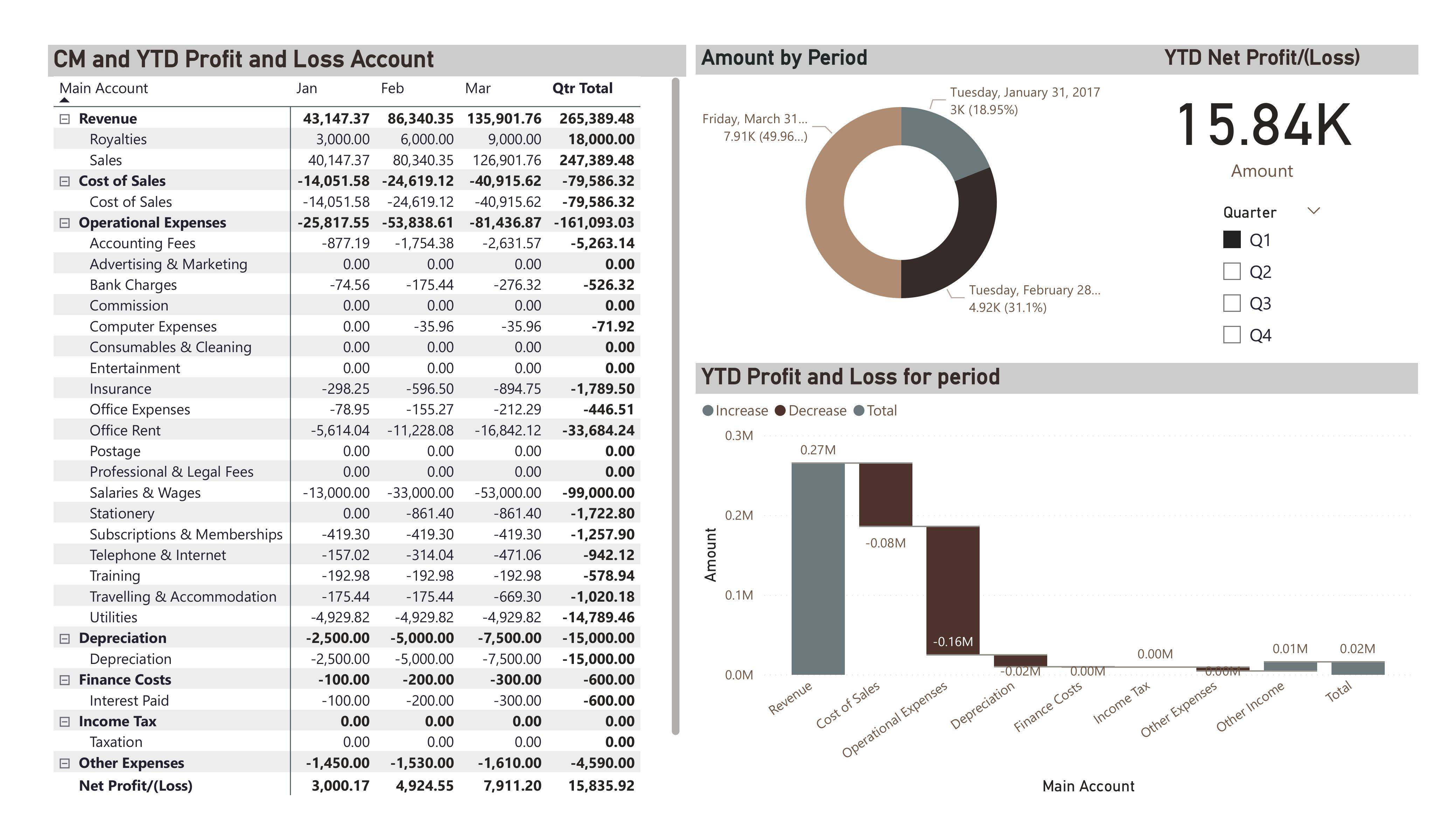
- Comprehensive P&L Table: Displays account-level figures for revenue, expenses, and net profit with filters to focus on specific quarters.
- Waterfall Chart: Breaks down profit and loss components, highlighting increases and decreases across categories.
- Period Distribution Chart: Visualizes how results are spread across different periods, making seasonal trends easier to identify.
- KPI Highlights: A dedicated metric card shows YTD net profit, offering a quick performance snapshot.
- Interactive Filters: Enables selection of specific quarters to focus on relevant financial periods.
Impact
This dashboard transforms complex financial data into an accessible, visual format that speeds up decision-making. By combining detailed transaction data with clear summaries, it allows both finance teams and leadership to quickly identify trends, monitor profitability, and adjust strategies for sustained growth.